Imagine using a screen reader during an online lesson and hearing this instead of “Photo of an apple orchard”: “C, colon, backslash, Users, backslash, debra dot cannon, backslash, AppData…” That actually happened when I ran an accessibility check on a real instructional document this week. It was a clear reminder of how easily accessibility can be overlooked, even in course content created with good intentions.
Why Accessible Materials Matter
Accessible design is not just an optional enhancement to instructional content; it determines whether learners can truly use what you create. Kumar et al. (2021) explain that although WCAG standards are widely available, many automated tools detect only some accessibility problems, so course designers cannot rely on one scan to confirm a document is accessible. The WebAIM Million (2024) report shows how widespread these issues are, finding low-contrast text on 81% of home pages and missing alt text on more than 21% of images across one million tested sites. These problems are not unusual; they are common, which is why every content creator needs to check for them directly.
What I Found
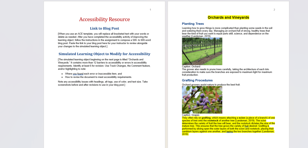
I evaluated a short instructional document titled “Orchards and Vineyards” and found more than enough barriers to work with. Some elements were fine, like a clear paragraph structure and reasonable line spacing. But several core problems jumped out immediately once I looked past the surface:
What I Changed
Every image’s alt text was literally a leftover file path from someone’s computer, not a description. The section titles looked like headings, but were just bold, centered text; a screen reader would read them as regular paragraphs, giving no way to navigate the document by structure. And three key vocabulary words were highlighted only by red text, with no bold or underline behind it, meaning the emphasis vanished for colorblind users or anyone using assistive tech.
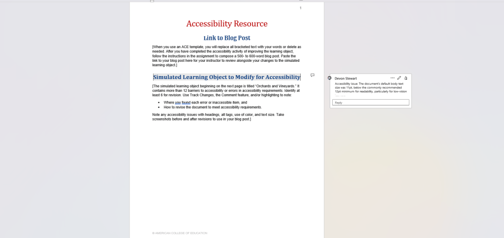
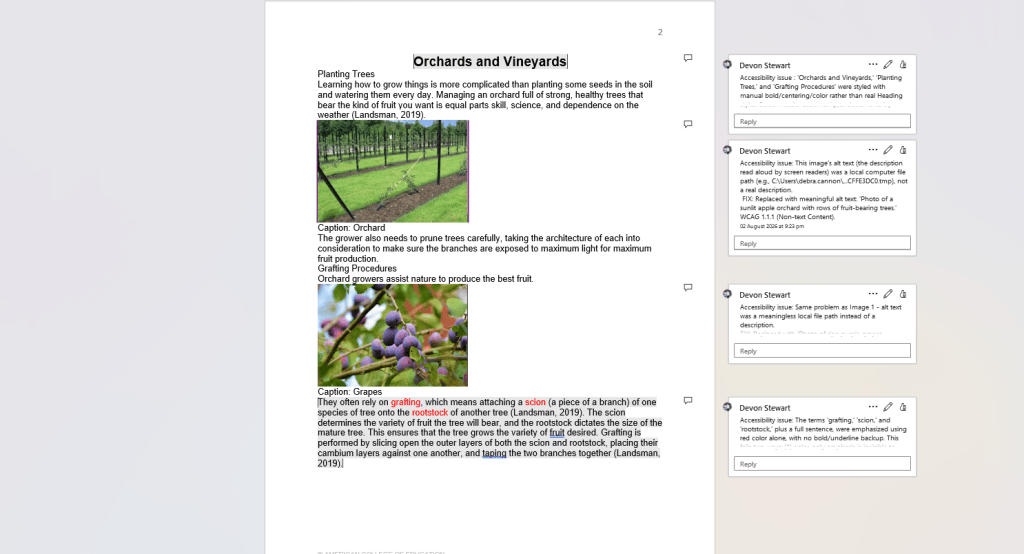
I rewrote all three images’ alt text into real descriptions, converted the fake headings into genuine Heading 1 and Heading 2 styles, replaced the color-only emphasis with bold text, added a caption that was missing entirely on the third image, and bumped the default body text up from 11pt to 12pt for readability.
Tools Worth Knowing
Three resources I’d point any instructional designer toward: WAVE, a free browser tool that visually flags issues directly on a webpage; PAC (PDF Accessibility Checker), built specifically for PDF/UA and WCAG compliance; and your word processor’s built-in Accessibility Checker (Word or Google Docs), which is often the fastest first pass before a document ever leaves your desktop.
The Real Test
None of these fixes were exotic. Alt text, real headings, sufficient contrast; these are basics, and yet they’re exactly what got missed. Success for a lesson like this one isn’t a clean report from a single tool. It’s a document where someone using a screen reader hears a description of an orchard, not a file path. What’s the last piece of course content you built that you’d want a second set of eyes, or a screen reader, to test?
References
Kumar, S., Shree, D. V., & Biswas, P. (2021). Comparing ten WCAG tools for accessibility evaluation of websites. Technology and Disability, 33(3), 163–185. https://doi.org/10.3233/TAD-210329
WebAIM. (2024). The WebAIM Million: The 2024 report on the accessibility of the top 1,000,000 home pages. https://webaim.org/projects/million/2024


Leave a comment